Zero-Page Applications

This is part 10 of a 12-part series called Distilling the Web to Zero. The web is far from done improving - particularly as it pertains to building rich web applications that are, to users, developers, and businesses alike, more desirable than their native-app counterparts. This series is prefaced by defining the biggest challenges on the road towards that goal and the 12 essays that follow explore potential solutions using concrete examples.
The uncanny valley of SPAs
"I picked real world examples, albeit more or less at random, because we need to reckon with the fact that single-page apps have kinda ruined the web."
– Rich Harris, creator of Svelte
No doubt, single-page applications have a bad reputation. The fact that Apple’s and Google’s app stores even exist is a daily reminder of the SPA's shortcomings. There'd be no reason for proprietary walled gardens to exist over the open web if users didn't overwhelmingly prefer native apps to SPAs. This isn't true for all of the open web though. Wikipedia is fantastic. StackOverflow is fantastic. There are many such examples but the pattern of whether a website is loved or loathed strongly correlates to whether it's a multi-page application (MPA) or a single-page application (SPA).
"The best SPA is better than the best MPA. The average SPA is worse than the average MPA."
– Nolan Lawson
If it ever feels like people are being too hard on SPAs or any JavaScript-based framework (like React Native), this is due to a phenomenon called the uncanny valley. This comes from robotics professor Masahiro Mori who noticed that people became increasingly positive and empathetic as robots became more human-like until a critical point at which point their responses became strong revulsion.

We see the same phenomenon in our movies. As CGI has become closer and closer to reality, our subconscious can’t help but reject what it is seeing. Considering this essay’s post date, here’s a Halloween-themed video about the uncanny valley with great visual examples of this cognitive dissonance.
SPAs suffer from the same challenge. The more a webapp tries to resemble a native app, the more its users seem to reject it as “not quite right.” They’ll likely be unable to articulate exactly what’s wrong, just that something feels off. Like a robot’s face with eyes that don’t “track,” apps are filled with thousands of subtle UI idiosyncrasies that distract the subconscious with every tiny deviation from the norm. Seemingly inconsequential things like mismatched scroll speeds, incorrect fling physics, web-based scroll friction, scroll-return management quirks, pagination links, non standard swipe interactions, and a header’s hide/reveal trigger all quickly add up to a death by a thousand cuts – and those are only the scrolling-related issues. Other topics like input fields are even more complex.
At this point, it's important to point out one ironic misnomer about "single-page" applications. They're usually composed of more than a single page. You can see the many URL routes when navigating from link to link. This "single-page" moniker was only ever meant to describe the page-refresh strategy, not the routing strategy. (This distinction will become important later.)
Who cares, you ask? As it turns out, this “document-first” mindset of the web is the largest single factor preventing webapps from becoming competitive with native apps. It's why mobile users have learned to distrust and avoid the dynamic web and believe a native app is always a better option.
In no way is this meant to imply that the URL was a bad idea. To give credit where it’s due, chopping up the Internet into individual, discrete documents interlinked by URLs is easily one of humanity’s greatest achievements. It’s beautifully simple and incredibly effective. Without this very basic concept, the Internet would simply not be the Internet. It certainly wouldn’t be called “The Web”. However…
Native apps are so much more than documents that can move.
This series has previously covered how JavaScript has already peaked so what hope is there for the open web to ever be able to compete with native apps? The answer lies, not in MPAs or SPAs, but in ZPAs: zero-page applications. (Yes, this is a weak acronym that won’t catch on, but bear with me through this zero-themed series.) ZPAs have all the rich micro-interactions of a client-side SPA but the simplicity of a server-side MPA. ZPAs are applications that operate outside the constraints of URLs. URLs are simply incompatible with native applications. While it is possible for URLs to coexist with native apps, their role is far more diminished and must evolve in a profound way as well. The golden age of native-like webapps will remain on the bench until developers can move beyond a URL-first mindset.
Explaining this well requires covering, not just native apps’ contentious past with URLs but also its partner in crime, the back button.
URLs in native apps
Implicit Intents
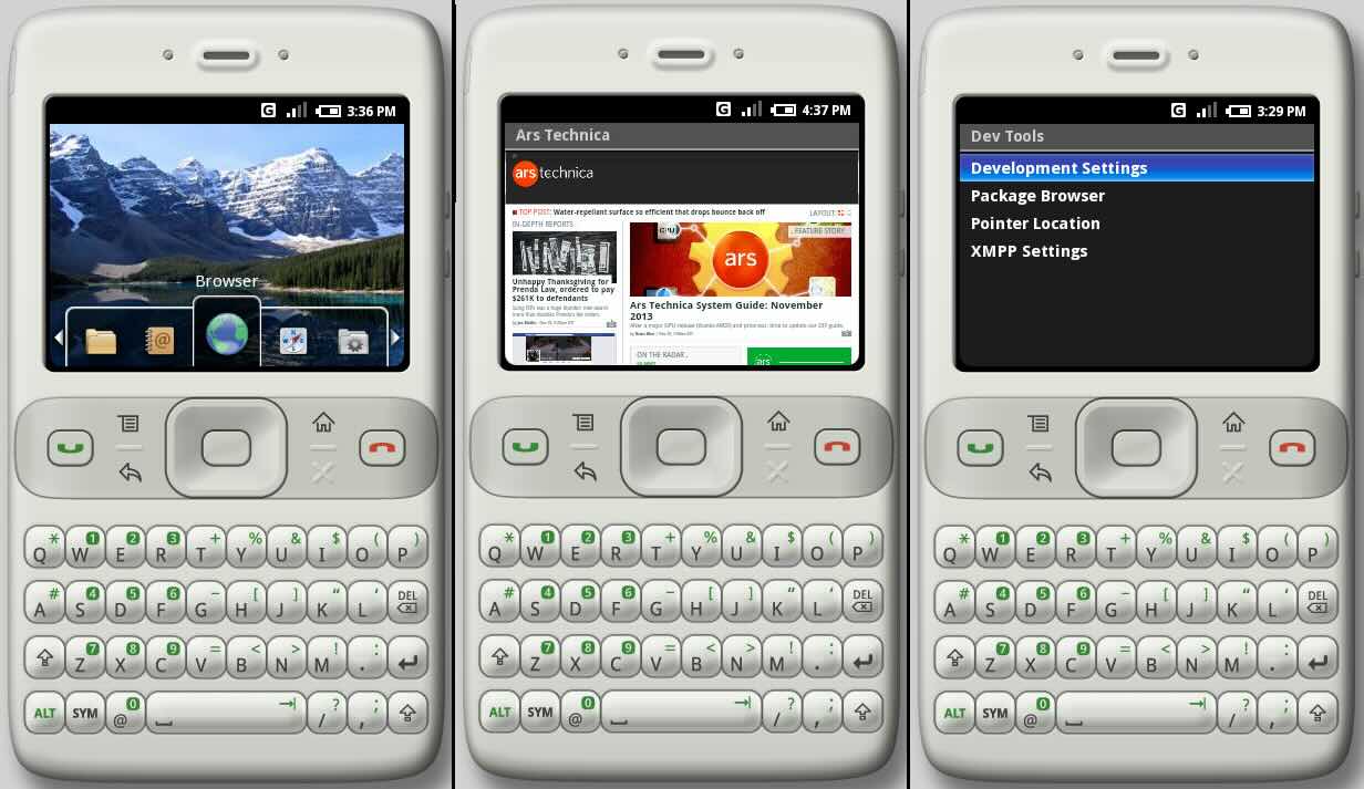
In 2007 (a year before the iPhone SDK was released) Google released the Android SDK to developers. With it, came a new spin on URLs called Intents. Intents became the foundation for launching anything on Android whether it was UI, a background service, or even broadcasts.
One of Intent’s biggest innovations were implicit Intents which enabled developers to send users to other apps by declaring a user’s intent in a generic, non-prescriptive manner. The user could then be sent to any app installed that had declared to the OS that it was capable of handling such an intent. If multiple apps qualified, the user could either use the disambiguation prompt or pre-configure a set of default apps.
This empowered the user to construct their own custom flows that interlaced a multitude of screens from a multitude of apps. For example, opening a URL could launch their favorite browser where you might then navigate to a “mailto:” link which could then launch your favorite email app where you could add a recipient which might present friends from your favorite contacts app followed by attaching a photo which could present a chooser-screen from your favorite photos app.
This meant Intents needed to support, not just explicit and implicit locations, but also provide a way to return complex data back to the calling app, whether it be a simple string, a strongly-typed value, a complex object with a custom set of fields, or even a resource stream to the file system coupled with the proper set of privileges.
All this extra flexibility came with a great deal of extra complexity. The humble URL was not enough to support it all. Intents made use of Actions, Categories, Extras, Flags, Data URIs, Request Codes, Result Codes, Intent Senders, Pending Intents, and more. In fact, Intents often included multiple URIs as a part of their definition and result-handling. Lastly, handling Intents incorrectly could lead to your app crashing, for example, incorrectly assuming a browser was always installed or running on devices with corporate policies or family safeguards.
Intents proved to be a great next evolution of the URL. Back then, however, native UI was far more simplistic than it is today. Initially there was a pretty clean 1:1 correlation between Intents and their Activities. But when iOS launched, it showed the world a richer way to navigate between screens using navigation controllers which could not be so cleanly defined by web-based routes since the boundaries between each screen was not so discrete and isolated but rather shared and overlapped. Android eventually followed suit by extending their Activity model to include Fragments thus complicating the clean 1:1 correlation Intents initially had with Activities.
Deep links
URL schemes are the section of a URL before the colon “:” e.g. http: or ftp: Android Intents were smart to embrace custom URL schemes as they became very popular on mobile. Desktop consumers rarely saw URL schemes beyond http(s): but on mobile, tel:, smsto:, mailto:, geo: and more were wonderfully simple ways to launch core utility apps. They were simple to understand and they had the added advantage of being easily embeddable in HTML, email, SMS, or even encoded into a QR code, an area where Intents fell short.
Both Android and iOS supported these and even encouraged the use of non-standard schemes like fb://profile/33138223345 or zoommtg://zoom.us/join?confno=...
Adoption of deep links would have spread even further if not for the desktop where launching native apps was, strangely, far less common. Desktop simply lacked many native utilities like Phone, SMS, Maps, etc. What’s more, other categories like social media, didn’t make the same leap from web to native on desktop like it did on mobile.
As convenient as deep links were, they quickly became problematic. As you can imagine, the lack of standardization or regulation led to an explosion of disorganized and poorly documented URL schemes. This also left the door open for some developers to “borrow” the schemes of their competitors. This lack of ownership and control had the unintended consequence of preventing app developers from ever adopting deep links as their app’s primary internal navigation strategy. Instead, usually only a few key deep links got mapped to a few key screens while the rest of the internal navigation was handled programmatically, without consideration for routing patterns.
Web links
Web links are just deep links that use http and https schemes. An app could declare to the OS which routes it was capable of handling using a mix of wildcard- or regex-based routing. This approach aimed to improve the challenge of launching a native app using a more desktop-compatible approach while simultaneously mitigating the app-not-installed issue since it could always just gracefully fallback to using a browser.
While this was an improvement over deep links, it still didn't address the issue of domain ownership and thus required the use of a “disambiguation screen.” This created a poor user experience reminiscent of Windows Vista’s allow/deny fatigue.

App Indexing
Google needed to solve the problem of how to do search with native apps when navigation isn’t always URL-based, there’s no sitemap.xml, and no way for its crawlers to fetch, parse and index the content.
So Google created Firebase App Indexing. Developers could add this SDK which would make their content available in search results but local to the device only. This was great for apps like note-taking apps.
Unfortunately these local-only results were only displayed when searching from Google’s native search UI but not from google.com. Eventually Google killed it, suggesting that developers use Android’s App Links and Apple’s Universal Links instead, which required app developers to mirror their content on the web so Google could crawl it “properly.”
App Links
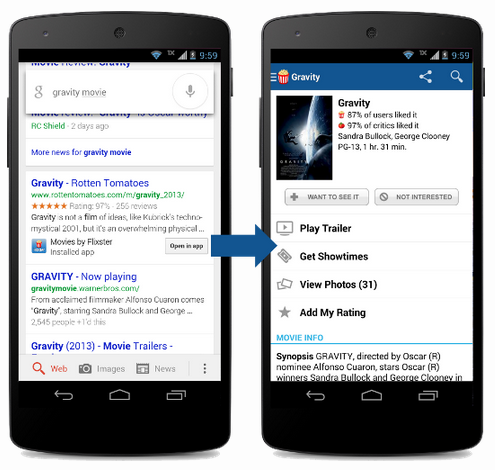
Many years after deep links, App Links improved on web links by addressing the issue of domain ownership. Configuring Intent Filters with autoVerify instructed the OS, upon installing an app, to fetch a specific “Digital Asset Links JSON file” from a predefined route on the trusted domain which helped verify ownership through Google’s Search Console.
This negated the need to present a tiresome disambiguation screen for every link tap. The OS could simply launch the proper native app without prompting beforehand and without “trampolining” through a browser first. Users could even customize these policies from their system settings.
Granted, this only worked if the user already had the app installed. Where this approach also fell short was in link wrapping. When marketers ran paid ad or email campaigns these tracking URLs did not share the same domain thus negating all its benefits and advantages at a time when it was needed most, i.e. a financial push.
302s and native apps have always mixed like oil and water.
Universal Links
Universal Links is Apple’s version of App Links except it used a different JSON file and relied on Apple’s backend services instead of Google’s Search Console.
Universal Links were an improvement over web links or deep links but the lack of control hindered deeper adoption for an app’s internal navigation. For example, Apple’s CDN would check for the presence of this file within 24 hours but devices would only check for updates once per week after app installation.
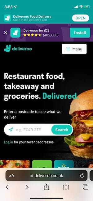
There was also the issue of phantom banners. Since Apple generates more revenue from native apps compared to websites they were incentivized to promote the installation of native apps to its Safari users. For any app with Universal Links set up, Apple would use Safari to natively inject a banner ad at the top and there was little to no way to control it, customize it, detect or measure it. Like Apple, app developers were also incentivized to direct users towards their native apps since retention is typically higher but with limited ability to predict or control Safari, this often led to a barrage of duplicate popups when browsing on mobile.
Dynamic Links
Since retention is usually much higher in native apps, companies naturally sought after a solution to convert their web users into native users as a part of their approach to URLs. Neither iOS or Android ever built support for the use case of how to handle URLs if the app is NOT installed so the private market stepped in to fill this gap with third-party solutions. The most popular of these was ironically Google’s but it did not come from the Android team but rather their Google Cloud and Firebase teams. Fortunately the cloud service was free and unlimited.
This included a highly complicated flow that differed depending on the user’s OS vendor, OS version, whether you typed the URL or tapped a link from inside or outside of a browser and more. Some flows even made use of an intermediate, web-based, interstitial screen that would pause the flow to secretly copy the wrapped URL’s target location to the user’s clipboard so that post-installation and on first-launch the app developer could manually navigate the user to the proper deep link. Other features included support for creating short-URLs as deep links to increase shareability across social networks.
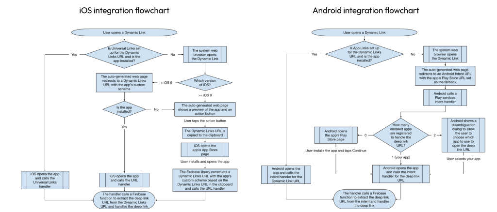
It was difficult to set up, difficult to integrate, sometimes required maintaining a secondary routing strategy across a secondary domain, and Apple eventually broke the flow due to security concerns around clipboard-abuse.
In the end, after becoming the de facto standard, Google killed it. The companies still offering similar solutions are not cheap.
App Clips & Instant Apps
There were parallel efforts to Dynamic Links that did have support at the OS level – Apple’s App Clips and Google’s Instant Apps. These weren’t exactly about converting web users into native users though. Instead they were lightweight duplicates of your native app with strict size requirements (between 5-15 MB) designed to download and launch quickly from either a web search result, QR code, or NFC tag. Their intended use case was for quick, one-time tasks like ordering food or renting a scooter. The goal was to enable native features with the same casual commitment as visiting a website by obscuring the installation step and then uninstalling once the micro-task was completed.
Unfortunately these didn’t see much adoption amongst developers beyond ordering scooters.
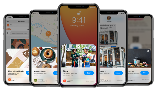
URLs never caught on in native apps like they did in web apps but it certainly wasn’t for a lack of effort. But it’s not all the fault of the URL. The back button shares equal blame.
Back buttons in native apps
In terms of UX, iOS had such a huge advantage over Android for the first decade - Apple chose to use a software-based back button while Android made it out of plastic – a physical part of the phone’s case. This seemingly innocent design decision created ripples of crippling UX gotchas throughout the system. Android was eventually able to phase out this design-debt by first upgrading hard buttons for an “on-screen navbar” and eventually to a gesture-based navigation. Thankfully Android now has a richness to their UI that rivals iOS but had Google’s designers not addressed this constraint, Android’s UI would still feel like using a mobile web browser.
This is because the intrinsic value of the URL goes deeper than simply being a pointer to a resource. URLs are what made the back-stack possible. When navigating a collection of documents, each page gracefully represents a natural checkpoint and users could navigate from page to page and site to site with confidence and predictability since the back button was this ever present safety net that could fix any wrong turn. The back button’s predictability was its strongest asset.
Unfortunately, when navigating a richer UI, like one in a native app, one composed of many micro-interactions, a back-stack is an anchor around your neck. It forces app designers into a hard constraint of linear navigation where any attempt to deviate from it is punished with frustrating idiosyncrasies. Rich user interfaces are fluid, continuous, overlapping, and above-all NOT linear.
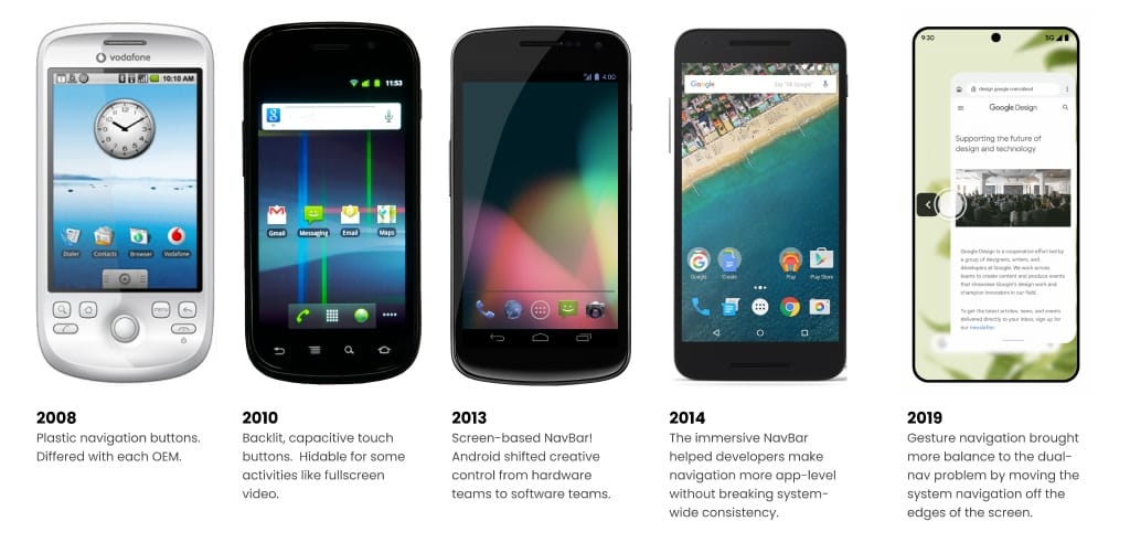
Lateral navigation
On iOS, the tab bar you find at the bottom of the screen is the workhorse of so many apps’ navigation. Interestingly, Android did not see the same adoption when they tried this pattern. Take this screenshot where the Android user just navigated from the first to the fourth tab. What is the expected behavior if the hard back button is pressed? Should it return you to the first tab or to the home screen? It’s complicated because this UI is technically composed of 4 sets of navigations each with their own back-stack (not too unlike tabbed browsing).
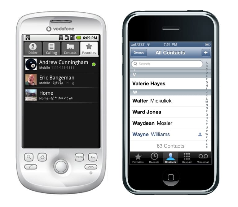
What’s more, if one tab is deeply navigated, it should retain that depth when visiting another tab just in case the user returns to the prior tab. The iOS screenshot is an example of this pattern. In fact the middle tab seems to even begin its root navigation with a deeply-navigated position as its root.
This is lateral navigation and it cannot be represented with a single back stack. Forcing this pattern would be as nonsensical as a desktop browser that sometimes switched its active tab when its back button was clicked.
Interestingly, this incompatibility is why the hamburger menu is so much more common on Android (and websites). Since it tucks away after each navigation, its mental model was less lateral and more of a “toggle” concept. This came at the cost of giving the root screen an elevated importance as opposed to equal billing amongst 2-5 tabs.
Up navigation
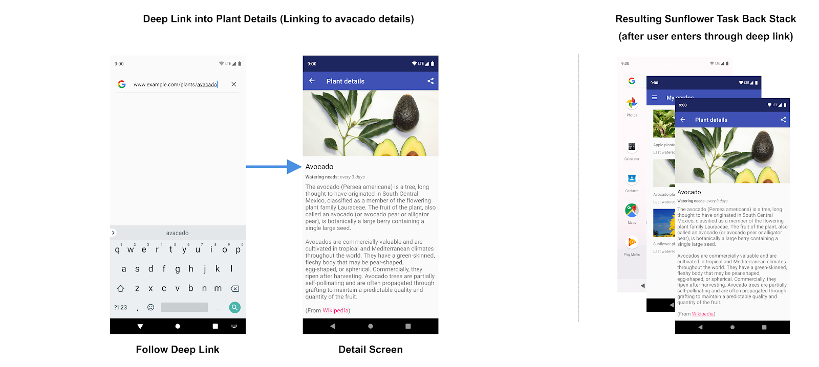
Android had another interesting challenge to address that iOS got to skip. Up nav is the situation when one app deep links into another app, for example, a details screen. As a concrete example, imagine tapping on a link for a specific X/Twitter post from inside your Gmail app.
In this situation, Android used to present two back buttons: one back arrow up top (where the hamburger-icon usually is) and one back button at the bottom (whether as plastic, in the on-screen nav bar, or even hidden as an edge-gesture). Should both buttons behave the same? As it turns out the answer is no.
The navbar’s back button at the bottom is conceptually more “task-oriented” and therefore indicates that the task is completed and should return the user to the calling app, i.e. Gmail. The arrow icon, in the top app bar, is contextually a part of the hamburger menu and indicates the users intent to be shown that screen’s hierarchical parent, i.e. the Twitter stream. The latter is an example of “up navigation.”
The presence of two back buttons brings confusion for users, developers and designers too. Fortunately Android’s move to gesture-based navigation at least sweeps the problem under the rug (or off the edge of the screen, in this case).
Atomic Flows
In a document-first web, there’s never a reason to prevent a user from going back one step. When designing a rich UI, this is a frequent need. Some flows need to be uninterruptible and temporarily prevent back-steps. Some must support going backwards multiple steps at once, like when canceling an atomic operation. When there’s an ever-present back button, like in your browser’s toolbar or like early Android phones, designers are forced to introduce all kinds of compromises that sacrifice polish and richness resulting in an app that’s stuck in the uncanny valley.
Apple was able to avoid this constraint with the simple use of software-based buttons. This empowered them to hide the back button when the context changed, enhance it with "cancel" or "done" labels or even cancel a flow midway by pulling down on the sheet. Browsers' URLs and back buttons cannot gracefully represent such concepts.
Another pattern that interrupts the natural flow of richer UI is leaning on HTTP redirects as a gatekeeping mechanism. This is seen for nearly every login on the web. There’s nearly always a route dedicated to this operation, like /login which must then re-redirect to a “remembered” route so it can try the failed task once more. This flow is jarring and breaks continuity in the app. When your UI isn’t bound to dedicated pages, it’s a far smoother UX to layer in subflows on top of parent flows.
Immersive apps
Immersive apps are a special category of apps that intentionally do not leverage the platform’s design system and creates a new, bespoke experience. They are often full screen, hiding even the topmost status bar where you see the time, network and battery icons.
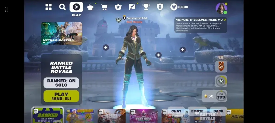
Usually immersive apps are games but not always. One commonality is that they operate as a sort of window into a different world instead of interacting with a flat surface. In such a context it becomes even more difficult to suspend the disbelief of UI that can be mapped onto the metaphor of “pages.” Everything is fluid and continuous and simply cannot be chopped up into discrete pages, and certainly not individual URLs, and certainly no predictable back button behavior. At best URLs can represent some kind of point in time, or checkpoint, but the vast majority of such a UI is too complex and fluid to be represented as a collection of pages.
The web has a continuity problem
If there was one word to describe the difference between webapps and native apps it’d be continuity. In the film industry, creating a seamless and consistent narrative can be challenging since camera shots might be taken at different times or different locations. When eyelines do not match up between cuts or clothes change from shot to shot or when a Starbucks cup is accidently included in a medieval setting, it breaks the audience’s suspended disbelief and rips them out of being fully immersed in the story. There’s even a person on set called a continuity supervisor whose full time focus is preserving continuity.
Continuity is what betrays a web page as being “not quite native” and keeps it anchored in the uncanny valley. Rich Harris, creator of Svelte, sums it up well, “Native app designers understand the importance of motion and object constancy in user interfaces but on the web we tend to teleport instantly from one place to another.” The difference is as stark as a pianist trying to play an arpeggio with one thumb and no pedal.
This is why it’s not enough for a webapp to simply adopt the same theme as a native app. It’s about look and feel. Motion is critically important when operating in the context of non-linear navigation. It tells the story of where something went and how you might get it back. It constructs a mental map in the user’s mind of where they navigated to, how to return, and how everything relates to its surrounding content. It is why minimizing a window on macOS uses a genie effect or downloading a file in Safari animates from the link, out of its containing window and into the Downloads folder of the Dock.
The web never needed to evolve such rich interactions since it came from a place of strictly linear navigation – one page to the next page, back and forth only. This minimalistic ethos for web design continues to this day but for the web to ever be competitive with native apps, it needs to adapt in not so subtle ways because every flicker of an HTML-swap or brief flash of white between page loads destroys continuity and the subconscious mind knows it’s being tricked.
Note:
There are two caveats worth mentioning. There’s the motion-sensitive crowd and the peak-speed use case (both of which prefer that animations be disabled). Many super nerds (and console clerks) prefer disabling animations because they’ve taken the time to master the art of keyboard navigation and animations slow them down. Ironically these are often the same people that build apps. This is a totally valid form of navigation but does not apply to the craft of building your typical native app which is hallmarked by its approachability, ease of use, and its appeal to the masses instead of the specialized few.
It’s worth mentioning the new View Transition API that helps animate elements between page-loads. Android tried the same thing years ago for Activities but it’s not commonly used. Developers had far more control with a monolithic approach and some things like scroll tracking simply aren't possible.
The web is trapped in “hybrid hell”
A native app is not a collection of moving documents, it is an elaborate state machine. However UI design is not a simple dichotomy. Every UI exists at some point on the spectrum between a collection of static documents and an elaborate state machine.
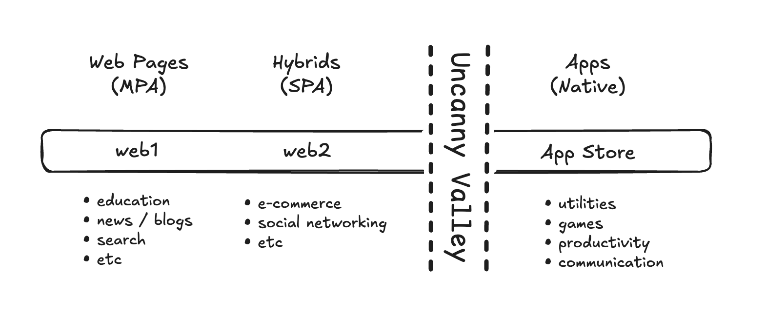
The web1 generation is generally defined by static documents and composed of categories grounded in long-form content like academic/educational material, news sites, blogs, search, etc. Here, MPAs and the page metaphor works very well.
The web2 generation is generally defined by hybrids, UI halfway between a webpage and a native app. It is composed of categories grounded in more dynamic use cases like e-commerce and social networking. Here it made sense to extend the page metaphor into something of a living catalog or dynamic book by enhancing it with things like buttons instead of links and client-side interactions instead of full page refreshes. Here, SPAs and the hybrid approach works very well.
The next generation of the web, web4, has yet to happen. Instead, this gap is currently being served by native app stores. It is composed of categories such as utilities, games, productivity, and communication, etc. While these categories do exist on the web, when given the option, people seem to overwhelmingly prefer their native alternatives. Even when built with web technologies, like Spotify, Slack and VS Code, the preferred way to use them is inside a native shell instead of directly in the browser. On this end of the spectrum, the page metaphor isn't helpful, it's problematic. It’s what keeps webapps anchored in the uncanny valley.
One might wonder, if Android made the transition from basic to rich UI, can the web ever do the same? Unfortunately the answer is no, at least not on its current path. SPAs and their client-side execution strategy will forever be married to the constraints that come with individual web pages, never perceived as more than enhanced documents. One cannot get out of a hole by digging deeper. Similarly the web cannot move beyond the hybrid spectrum by using more hybrid techniques. A radically different approach is needed. Like the painful evolution and awkward teen years that Android had to endure, getting the web into its next generation requires unwinding some foundational assumptions about the way the web should work and unlearning many of the patterns that made the web so successful in the first place.
The birth of a new category on the web
Web4’s mission is to evolve the open web to be competitive with native apps. Its goal is to pass a Turing test of sorts for UI – a threshold where a webapp’s UI becomes indistinguishable from that of a native app, finally escaping the uncanny valley.
Web4 is a forked initiative not a succession plan. Accomplishing its goal is NOT about imposing changes upon web1 or web2 much the same way that web3 had zero intentions of replacing the relational database. Instead, this is about creating a new species on the web.
In other words, web4 isn't trying to be a better SPA, or occupy any portion of the hybid spectrum range. Web4 is meant to target the far end of the spectrum on the other side of the uncanny valley. The only way to get there is not with incremental improvements but with radically different approaches, many of which run in the opposite direction of today’s best practices.
The URL must change
Like in native apps, URLs must become a “sometimes food” – no more 1-to-1 correlation between URLs and webpages. The only way to move beyond the constraints of the document-based web is to become a ZPA – a zero page application. In this model URLs are used not as pointers to resources but rather as bookmarks for state. The vast majority of the app will operate without the need to define routes. If there’s a need for a different website to “deep link” into a web4 app, a route can be created for that purpose, as needed.
The protocol must change
Since the URL is treated as a bookmark for state rather than a pointer to a resource, the code associated with a route is a void function, i.e. it returns nothing. Instead it modifies the app’s state. After setting the app’s state to the desired “checkpoint,” the server will either respond to the GET with a full HTML payload and immediately upgrade to a WebSocket connection, or if the server already has a WebSocket connection established, it must respond to the GET with a 204 Not Modified response and no payload while pushing instructions for mutating the DOM over the WebSocket. This has the added advantage of the server being able to react to state changes outside the constraints of a restrictive request-response protocol like HTTP.
The framework must change
DOM elements can be listened to just like traditional web development but in this model these handy events will bubble up beyond the browser, over the wire, and up to the server. The server can then run the proper event handler which will ultimately make state changes which the UI can then react to and push instructions for updating the DOM back down to the browser. This approach to event listeners has the following advantages:
- The simplicity of an MPA
This eliminates the need to rationalize about your app running in two places (i.e. client and server), since it runs 100% on the server. - Fewer moving parts
There’s no need to create and maintain a separate REST API since all event handlers live on the server and it can query the database like an old fashioned MPA. Even the need for POSTs are eliminated since this model makes it trivial to bind the values of inputs with server-side state. - Language choice
When your app runs 100% on the server, developers are not forced to use JavaScript in order to drive a rich UI. They can choose any language. - Real-time by default
State changes can come from other places too, not just event handlers, perhaps a db query listener on a real-time database. State changes aren’t isolated to just a single user but can be shared across all connected users or even customized groups of users. This creates a step function in real-time opportunities.
The architecture must change
The venerable MVC pattern is at odds with the goals of Web4. MVC uses a URL-first approach and by design, begins its life by associating a new route to a new “view” which perpetuates that 1-to-1 correlation between URLs and pages (i.e. views), the very thing Web4 aims to escape.
Instead, something more akin to a MVVM pattern should be used except in this context the V represents micro-components, not pages. What’s more, this enables a profound reversal in dependencies. Instead of your frontend taking a dependency on your backend, your backend can take a dependency on your frontend. This will open the floodgates for reusable UI on a massive scale and at the screen-level, not just individual components operating in isolation. In other words, to use IDE terminology, this means a web4 UI project is a library and the backend project is the runnable service.
This dependency-reversal has the advantage of elevating designer-autonomy to unparalleled heights since, in the absence of all business logic, the complexity of building a frontend would be reduced by orders of magnitudes. This process would be more akin to mocking up static HTML files… except they wouldn’t be mocks, they’d be production-ready. This will likely have the side effect of merging the two roles of designer and frontend developer into a single role.
The back button must change
It’s time to bring the popup window back from the dead. This is not a joke. The only way to fully escape the tyranny of the back button is to operate in a window where there isn’t an ever-present back button that undermines the designer’s every attempt to evolve beyond primitive linear navigation. Web4 apps will still bring their own “soft button,” like iOS, but that must be an application-layer implementation detail.
You can already see this in action to some degree with many popular desktop apps like Spotify, Slack, and VS Code. These are all webapps running in a minimalistic web browser shell called Electron. This enables the developer to remove the brower’s the back button (as well as the URL bar as it would be awkward navigating to a different website from inside “the Spotify app.”) Electron enables the added advantage of being treated as a first class citizen by the rest of the OS enabling it to participate in OS-level UX like app-launchers and task switchers (e.g. the Dock and Exposé). However web4 apps must be able to get the “Electron treatment” from the browser directly without the overhead of Electron.
The mobile space’s approach to popups are quite a bit different since apps run full screen, not windowed. Similarly, a web4 app must be represented by a launchable icon on the homescreen and when launched, run the browser full screen, edge-to-edge, with no “navigation chrome” (i.e. no back button). This is already possible, just rarely done.
The refresh button must change
Removing the back button comes with the added advantage of removing the refresh button too. But that puts the burden of never-stale data on the shoulders of busy developers. Therefore, it becomes critically important that all web4 apps be real-time by default. Hoping that enough developers will sprinkle in enough real-time features in here and there is a recipe for disappointment. Real-time interactions must become the default outcome, not a nice-to-have. Thankfully, web4’s always-present WebSocket and massively-shared, server-side state makes real-time apps the default outcome.
The browser must change
The web browser itself will need to evolve. Today it’s treated as a strict rectangular surface. For web4 to reach its full potential, it will need to be able to “reach beyond the window.”
Oddly shaped windows aren’t quite the goal – a better example is the menuing system. macOS puts an applications’ menus at the top of the screen shared with all apps but even operating systems that anchor menus at the top of each window will often render beyond the boundaries of the window for large menus. Besides, having two sets of menus, one for the browser’s functions and another one below it for the “child app” is one of the fastest ways to communicate that this app is a 2nd-class citizen.
This issue runs deeper than just menus, however. Translucency has become a critically important ingredient in the design language of any modern desktop windowing system. Before webapps can be treated as full equals they must be able to render with the full capabilities of the environment’s design system. Opaque-only surfaces will serve as a clue to our subconscious minds that this app fails the UI Turing test.

Member discussion